SUBPLOTS IN MATPLOTLIB
In this tutorial, we are going to learn about subplot in matplotlib. As we have covered so far, matplotlib is all about creating figures.
What is Subplot in Matplotlib?
We have an inbuilt pyplot function that is used for creating multiple plots on a canvas known as subplots(). The subplot function takes in two main arguments as rows and columns which we use for defining the number of rows and columns of the subplots because the subplots works as the same as a matrix.

Empty Subplot in Matplotlib
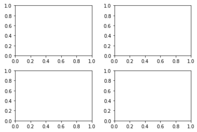
You can add data to get a figure along with axes, colors, graph plot etc. However, there might be times where you want to create subplot in matplotlib within one big giant plot. Or in other words, you can classify in one plot. There is no limit to having subplots, you can create as many subplots as you want. Subplots can be created by defining rows and columns, Let’s create 4 (2×2) a matrix empty subplots for our understanding before we populate it with data:
import matplotlib.pyplot as plt

fig, axes= plt.subplots(nrows=2, ncols=2)

plt.tight_layout()
plt.show()
Output:

In the above figure, we imported the matplotlib.pyplot library and created two variables fig (for the figures) and axes (rows and column wise to populate with data) and set them equal to plt.subplots(nrows=2, ncols=2) as defined per our matrix. We then use another function known as plt.tight_layout() which prevents subplots to overlap each other and keeps the mega plot uniform. Finally we use the plt.show() function to show the output.
Subplot with Data
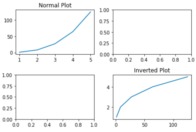
Let’s populate 2 subplots by using axes (rows and column position) and plot values of x and y coordinates. You can pre-set the x and y values by storing data in them.
import matplotlib.pyplot as plt

fig, axes= plt.subplots(nrows=2, ncols=2)

x = [1,2,3,4,5]
y = [x**3 for x in x]

axes[0][0].plot(x,y)
axes[0][0].set_title("Normal Plot")

axes[1][1].plot(y,x)
axes[1][1].set_title("Inverted Plot")
plt.tight_layout()
plt.show()

We have used the matrix position of the subplots (rows and columns) and plotted values of variables x and y to plot normal and inverted plot. We have added titles too to make sure that the difference shows. You can have your own data for x and y coordinates and create as many plots as you want. For example, you can create a scatter plot on subplots too with your own defined data:
import matplotlib.pyplot as plt

# Soda consumption 2018-2019 data
drinks = ['pepsi', 'mirinda', '7up', 'Coca Cola']
q1 = [300, 50, 150, 600]
q2 = [302, 43, 167, 650]
q3 = [310, 47, 78, 609]
q4 = [303, 45, 80, 680]


# Introducing subplots to distribute data over 4 quarters
#figure size is the size of each subplot
#sharex and sharey stops the axes to display reduntant information
#nrows, ncols : int, optional, default: 1, Number of rows/columns of the subplot grid.
#Here 2 and 2 is col and row
#fig and axes are the two variables given to the x and y coordinates.
fig, axes = plt.subplots(2, 2, figsize=(8, 6), sharex=True, sharey=True)

# suptitle function adds a centered title to the full canvas.
fig.suptitle('Soda consumption 2018-2019', fontsize=18)

# Top Left Subplot
plt.xlabel("Soda Drinks")
plt.ylabel("No. of bottles (millions)")
axes[0,0].scatter(drinks, q1)
axes[0,0].set_title("Quarter 1 consumption")

# Top Right Subplot
axes[0,1].scatter(drinks, q2)
axes[0,1].set_title("Quarter 2 consumption")

# Bottom Left Subplot
axes[1,0].scatter(drinks, q3)
axes[1,0].set_title("Quarter 3 consumption")

# Bottom Right Subplot
axes[1,1].scatter(drinks, q4)
axes[1,1].set_title("Quarter 4 consumption")


plt.show();
Output:


