STYLING GRAPHS IN MATPLOTLIB
In this tutorial, we are going to learn about different styling references for data visualization in Matplotlib.
Defining Your Own Style Techniques in Matplotlib
You can define your graph styles which are available in the matplotlib styling library. In order to fetch how many styles are available in matplotlib, use the following statement to see the output:

import matplotlib.pyplot as plt
import matplotlib as mlp
print(plt.style.available)
Output:
['bmh', 'classic', 'dark_background', 'fast', 'fivethirtyeight', 'ggplot', 'grayscale', 'seaborn-bright', 'seaborn-colorblind', 'seaborn-dark-palette', 'seaborn-dark', 'seaborn-darkgrid', 'seaborn-deep', 'seaborn-muted', 'seaborn-notebook', 'seaborn-paper', 'seaborn-pastel', 'seaborn-poster', 'seaborn-talk', 'seaborn-ticks', 'seaborn-white', 'seaborn-whitegrid', 'seaborn', 'Solarize_Light2', 'tableau-colorblind10', '_classic_test']
In order to use the style, simply use this statement:
plt.style.use()
Styling with Matlplotlib: ggPlot()
ggplot() is based on R programming plotting system. It creates a ggplot object. This type is used for analyzing the input data for professional looking graphs while having to write less code.
Let’s look at a quick example to further understand using these styles with a simple line graph:
import matplotlib.pyplot as plt
import matplotlib as mlp

#using the style
plt.style.use('ggplot')

#drawing simple plot
plt.plot([1,2,3],[6,9,3])

#showing the plot
plt.show();
Output:

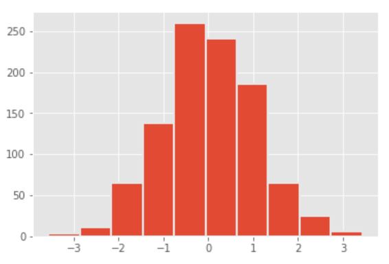
Let’s create a histogram in ggplot and use the edge color attribute:
import matplotlib.pyplot as plt
import numpy as np
import matplotlib as mlp #using the style
plt.style.use('ggplot')
x = np.random.randn(1000)
plt.hist(x, linewidth=2, edgecolor='#E6E6E6');
Output:

Styling with Matlplotlib: fivethirtyeight()
fivethirtyeight() or 538 plotting style creates beautiful graphs with cool colors and thick weight lines. The font used by the style is Decima Mono which gives it even a more pretty look. There are enough margins between the lines especially in histograms. We can create our own edge color, linewidth, color change of the data under analysis etc with this style.
Let’s try the fivethirtyeight() stylesheet in Matplotlib:
import matplotlib.pyplot as plt
import matplotlib as mlp

#using the style
plt.style.use('fivethirtyeight')

#drawing simple plot
plt.plot([1,2,3],[6,9,3])

#showing the plot
plt.show();
Output:

Let’s create a histogram using the fivethirtyeight style:
import matplotlib.pyplot as plt
import numpy as np
import matplotlib as mlp #using the style
plt.style.use('fivethirtyeight')
x = np.random.randn(1000)
plt.hist(x, linewidth=2, edgecolor='#000000');
Output:

Styling with Matlplotlib: grayscale()
Matplotlib provides all kind of options for users who have different preferences and color usage. Let’s you want to print your analysis or plotting in black and white or you have limited data that is describable in 2 contrast colors then you can use the grayscale() plotting stylesheet.
Let’s try the grayscale stylesheet in Matplotlib:
import matplotlib.pyplot as plt
import matplotlib as mlp

#using the style
plt.style.use('grayscale')

#drawing simple plot

plt.plot([1,2,3],[6,9,3])

#showing the plot
plt.show();
Output:

Let’s create a histogram in grayscale with white edges:
import matplotlib.pyplot as plt
import numpy as np
import matplotlib as mlp #using the style
plt.style.use('grayscale')
x = np.random.randn(1000)
plt.hist(x, linewidth=2, edgecolor='#ffffff');
Output:

tableau-colorblind10 stysheet is used for particularly targeting colorblind spots of the analysis. It may be safe to say that it can be easily viewable by people who are colorblind because of the color combination the stylesheet uses.
Let’s try the tableau-colorblind10 stylesheet in Matplotlib:
import matplotlib.pyplot as plt
import matplotlib as mlp

#using the style
plt.style.use('tableau-colorblind10')

#drawing simple plot
plt.plot([1,2,3],[6,9,3])

#showing the plot
plt.show();
Output:

Let’s create a histogram using tableau-colorblind10 style:
import matplotlib.pyplot as plt
import numpy as np
import matplotlib as mlp #using the style
plt.style.use('tableau-colorblind10')
x = np.random.randn(1000)
plt.hist(x, linewidth=2, edgecolor='#ffffff');
Output:


