SCATTER PLOTS AND PIE CHARTS
In this tutorial, we are going to learn about scatter plots and pie charts in Matplotlib. We will look closely at the scatter and pie methods which enable us to draw the required figures.
What is a Scatter Plot?
We use a lot of data visualisation techniques to represent data both horizontally and vertically with the plotting points. And each technique defines a specific purpose. A scatter plot contains points that are floating all over the screen. These points are not connected with a line or represent any bar. Scatter plots allow us to show the correlation of one variable with the other.

We will use the plt.scatter() function and with axes x and y. Let’s draw a scatter plot:
import matplotlib.pyplot as plt

# values
x = [3,6,9,12,15,18,21,24,27,30]
y = [1,3,5,7,9,11,13,17,19,21]

# Using the scatter method
plt.scatter(x, y, label= "Dots", color= "red")

#Axes
plt.xlabel('x axis')
plt.ylabel('y axis')

# plot title
plt.title('This is a scatter plot')
plt.legend()

#Showing the plot
plt.show()
Output:

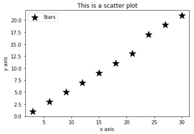
You can also use the marker option for different types of scatter points such as star, dot etc, you can set the size for the markers as well. For example:
import matplotlib.pyplot as plt

# values
x = [3,6,9,12,15,18,21,24,27,30]
y = [1,3,5,7,9,11,13,17,19,21]

# Using the scatter method
plt.scatter(x, y, label= "Stars", color= "k", s=200, marker="*")

#Axes
plt.xlabel('x axis')
plt.ylabel('y axis')

# plot title
plt.title('This is a scatter plot')
plt.legend()

#Showing the plot
plt.show()
Output:
What is a Pie Graph?
Pie graph or pie chart is a lot like a bar graph, i.e. for a specific category of a plot. But pie chart is used to show slices of the whole figure of what we know as a ‘share’. Just like in excel, matplotlib also works best in pie graphs. We just need to provide the data and we are good to go, for example:
import matplotlib.pyplot as plt

# defining labels
time_table = ['write', 'exercise', 'eat', 'study']

# portion covered by each label
time = [50, 10, 10, 80]

# color for each label
colors = ['r', 'lightblue', 'pink', 'b']

# plotting the pie chart
plt.pie(time, labels = time_table, colors=colors,
        startangle=90, shadow = True, autopct = '%1.1f%%')

# plotting legend
plt.legend()

# showing the plot
plt.show();
Output:

Let’s quickly look at the properties of pie graph. We have used the labels as slices names for the pie chart. Next, we can add our own required color for slices. Shadow is used to put a shadow on the slices. Startangle defines the rotation angle of the pie chart. Explode is used for offset each slice in the pie chart apart from the rest of the slices. autopct is used for formatting the value of the slices mentioned in terms of percentages.
We have learned about the scatter plots and pie charts in detail by looking at their examples and defining how they can be useful in analysing different kind of data.

