BAR GRAPH AND HISTOGRAMS
In this tutorial, we are going to learn about bar graphs and histograms and learn about the main differences between them.
What are Bar Graphs?
Bar graphs are used to represent comparison between different categories of data. The visualization is displayed in grouped data as rectangular bars of equal length. You can change the orientation of these bars horizontally and vertically. Let’s look at a quick example of a simple bar graph:

import matplotlib.pyplot as plt
import numpy as np

languages = ('Python', 'C++', 'Java', 'Perl', 'Scala', 'Lisp')
y = np.arange(len(languages))
popularity = [10,8,6,4,2,1]

plt.bar(y, popularity, align='center', color='pink')
plt.xticks(y, languages)
plt.ylabel('Popularity')
plt.title('Most loved programming languages')

plt.show();
Output:
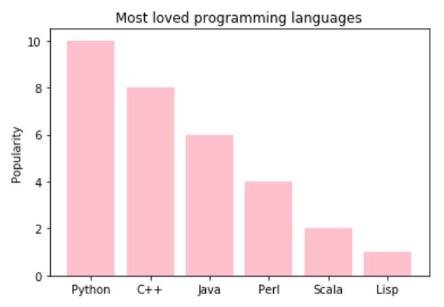
We created simple values of languages and their popularity and gave them a value based on how much usage they have. We graphed languages on x-axis and popularity on y-axis. The values are incremental in nature and you can see that in the graph that Python is the most popular programming language.
Comparing Values in Bar Graphs
We can use bar graph to compare several values as well to show comparison visually by applying one color for each area.
Let’s plot a multiple bar chart graph and compare values with one another by targeting the rows one by one. By giving different colors like green, blue and red to each category’ you can add your own desired colors. We can put them under comparison to each other now in a horizontally stacked cluster to see which category stands where.
import numpy as np
import matplotlib.pyplot as plt
data = [[10,30,25,40],
[35,30,20,30],
[20,38,40,29]]
X = np.arange(4)
fig = plt.figure()
ax = fig.add_axes([0,0,1,1])
ax.bar(X+0.25, data[0], color = 'b', width = 0.25)
ax.bar(X+0.50, data[1], color = 'g', width = 0.25)
ax.bar(X+0.75, data[2], color = 'r', width = 0.25)

plt.show()

We can use the stacked multiple bar graphs as well for different categories.
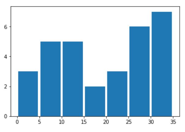
What is a Histogram?
Histogram is a kind of a bar chart that is used for representing statistical information by how a bar looks based on the probability distribution i.e. the complete of class intervals (grouped set of data) and frequency distribution on x and y axis. Histograms also has bins which are the difference between the frequency distribution values. If frequency distribution values are equal in intervals then the bins would be same in size else different intervals will have different bin sizes. Let’s look at an example:
import matplotlib.pyplot as plt;
import numpy as np
import matplotlib.pyplot as plt

sold = [2,2,3, 5,6,7,8,9,10,10,10,10,10,15,15,20,20,20,25,25,25,25,25,25,30,30,30,30,30,30,30]
price_range = [0,5,10,15,20,25,30,35]

y_range = [0,2,4,6]

plt.yticks(y_range)

plt.hist(sold, bins = price_range, rwidth=0.9)

plt.show();
Output: