DRAWING A SIMPLE PLOT
In this tutorial, we will learn about creating a simple plot in matplotlib by working with pyplot module, we will learn about creating a graph using labels.
Simple Plot in Matplotlib
We will create a simple plot in matplotlib. We will be working with pyplot module throughout this lesson. Let’s look at a simple example of drawing a simple graph:

from matplotlib import pyplot as plt
#drawing simple plot
plt.plot([1,2,3],[6,9,3])
#showing the plot
plt.show();
Output:
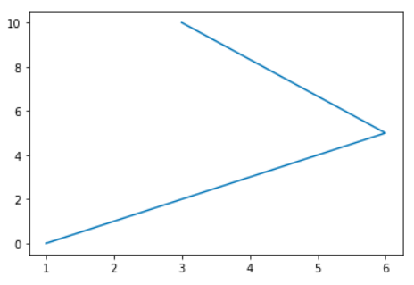
Above, we have imported the pyplot module from the matplotlib module and plotting two lists of x and y, and finally declared the plot through the plt.show() method.
Plotting Graph with Labels
You can also use variables to store the values of your axes while drawing your graph in matplotlib.pyplot. Furthermore, we can add titles, labels to make sense of the data provided.
from matplotlib import pyplot as plt
#drawing simple plot
x = [1,2,3]
y = [4,5,6]

plt.plot(x,y)

#Labelling Graphs
plt.title('Main Graph')
plt.ylabel('y axis')
plt.xlabel('x axis')

#showing the plot
plt.show();
Output:
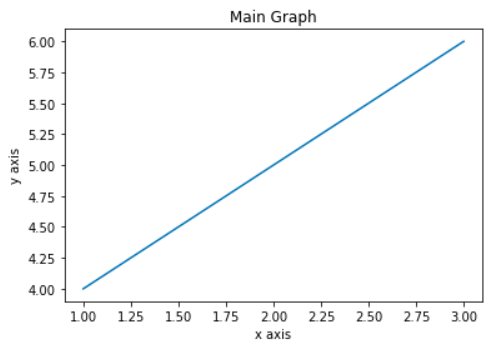
Suddenly, this graph makes more sense than the previous one.
In order to understand simple plotting in more detail, let’s look at an example which will be the combination of numpy and matplotlib. Here is an example of a sine wave plotting:
from matplotlib import pyplot as plt
import numpy as np
x = np.arange(0, 3.14*2, 0.05)
y = np.sin(x)
plt.plot(x,y)
plt.xlabel("angle")
plt.ylabel("sine")
plt.title('sine wave')
plt.show()
Output:
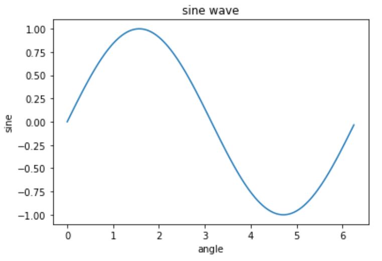
You can use both numpy and matplotlib together for complex equations.
Creating Multiple Lines of Plots
Let’s create multiple lines of plot in numpy and matplotlib and also style them in order to differentiate between them.
from matplotlib import pyplot as plt
import numpy as np
x = np.linspace(0, 10, 1000)
plt.plot(x,np.sin(x),'g', label='sin(x)')
plt.plot(x,np.cos(x), ':b', label='cos(x)')
plt.xlabel("angle")
plt.ylabel("waves")
plt.axis('equal')
plt.title('sine and cos wave')
plt.legend()
plt.show()
Output:

In the above graph, we have created the multiple plots by using x axis as the linspace function and y axis as the sin and cos of x and we created two different styled plots for each wave by adjusting them to be equally distributed by the axis using axis function set to ‘equal’. We have also added labels on both x and y axis to clarify angle and waves section.
Also, you can see that we have used the legend() function to distribute the dashed and straight lines showing the distinction between the two waves. We will discuss more about the legend function in detail in the upcoming articles.

