STACK PLOTS IN MATPLOTLIB
In this tutorial, we will learn about stack plots or area plots in Matplotlib followed by a handy sales example for more clarity.
What is a Stack Plot?
There are a number of different graphs available in matplotlib like line plots, bar graphs, histograms pie charts etc.

Stack plots in matplotlib are called stack plots because each classified part of data is stacked on top of each other, and shows the total coverage of that classified data in terms of volume and weight. The way data is presented in stackplots is similar to pie charts. However, pie charts don’t contain axes like stack plots. Pie chart can analyze one set of data at one point where as we can classify and analyze different set of data stacked together in stack plots.
It’s a bar graph or a line chart that is distributed into its sections for us to see comparisons as well as the whole graph thing. Matplotlib does have functions that are used as a supplement for filling spaces between line graphs etc. But here, we are specifically looking at the stackplot() function more our clarity.
Stack Plot in Matplotlib: Sales Example
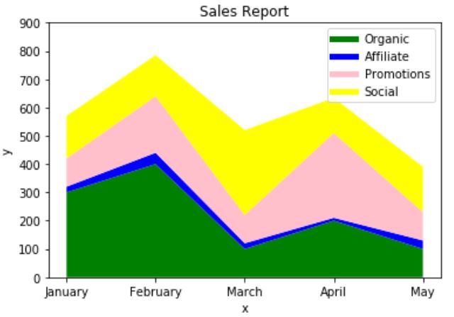
Let’s look at the code below where we are going to analyze total sales that came in from different sources; we are going to plot Organic, Affiliate, Promotions and Social Sources of Sales in the plot. We will use labels, colors (to show different sets) and well as legend to initiate the labels. For Example:
import matplotlib.pyplot as plt
import numpy as np
months = ['January', 'February', 'March', 'April', 'May']
Organic = [300,400,100,200,100]
Affiliate = [20,40,20,10,30]
Promotions = [100,200,100,300,100]
Social = [150,145,300,124,160]
plt.plot([],[],color='green', label='Organic', linewidth=5)
plt.plot([],[],color='blue', label='Affiliate', linewidth=5)
plt.plot([],[],color='pink', label='Promotions', linewidth=5)
plt.plot([],[],color='yellow', label='Social', linewidth=5)

plt.stackplot(months, Organic, Affiliate,Promotions, Social, colors=['green','blue','pink','yellow'])

plt.xlabel('x')
plt.ylabel('y')

plt.yticks(np.arange(0, 1000, step=100))

plt.title('Sales Report')

plt.legend()
plt.show()
Output:

Once the stack plot is created, you can see that Organic and social network source got the best sales covering the main volume of the whole sale, whereas promotions did steadily good there and affiliate sales scored the lowest.
You can see how stack plot can give an overview by stacking sets of data of the same source and shows you the final view.


