RADIOBUTTON IN TKINTER
In this tutorial, we are going to learn about using radiobutton in tkinter application. We will learn about different features and methods of radiobuttons followed by a handy example
What is Radiobutton in Tkinter?
The Radiobutton widget in Tkinter is a way of implementing choices in your Python GUI application. You can set multiple choices for the user and a user is free to select any one from them. A single radiobutton displays The syntax for using radiobuttons is:
radiobutton_tk = Radiobutton( window, features )
Radiobutton features and properties are:
| 1 | activebackground | Shows the background color of the radiobutton upon the mouse hover. |
| 2 | activeforeground | The font color of the widget text when it has the focus. |
| 3 | anchor | It’s shows the initial position of text. It’s initial value is always the CENTER position which is used to position the text in the middle position. |
| 4 | bg | Displays the background color of the checkbutton |
| 5 | bitmap | It is used to display bitmap in the widget but if the image option is already given then this option will be ignored. |
| 6 | borderwidth | Show the border size. |
| 7 | command | It is used to set the function call whenever there is some change. |
| 8 | cursor | You can use the cursor as different shapes on the screen as circle, dot etc. |
| 9 | font | It shows the font of the radiobutton. |
| 10 | fg | Determines the foreground color of font that is used for the radiobuttons. |
| 11 | height | It represents the height of the radiobutton (number of lines). The default height is 1. |
| 12 | highlightcolor | It shows the highlight color of the checkbutton when it is clicked. |
| 13 | highlightbackground | It shows the highlight color of the background of the checkbutton when it is clicked. |
| 14 | image | It is used to set image on the radiobutton. |
| 15 | justify | It is used to display text on radiobutton in RIGHT, LEFT and CENTER justified positions. |
| 16 | padx | Adds padding in the horizontal direction |
| 17 | pady | Adds padding in the vertical direction. |
| 18 | relief | This displays different types of borders. By default, it has a FLAT border. |
| 19 | selectcolor | Sets the color of the checkbutton. |
| 20 | selectimage | Shows the image on the radiobutton upon setting/selecting. |
| 21 | state | This represents DISABLED or ACTIVE state of the radiobutton. |
| 22 | text | This feature determines what will be mentioned as a text of the radiobutton
E.g. text=”Hello, Radiobutton” will be used as a radiobutton text. |
| 23 | textvariable | By using this feature, you can easily update the text of the message whenever you want. |
| 24 | underline | It shows the index of the characters in the text which are to be underlined. The indexing always starts at 0. |
| 25 | value | Represents the value of each radiobutton when it is assigned to the control variable when it is under selection. |
| 26 | variable | It shows the control variable which is used to monitor the state of the radiobutton. |
| 27 | width | Shows the width of the radiobutton horizontally. |
| 28 | wraplength | Sets the wrap length of the number of characters to be used. |
Methods of radiobutton are:
| 1 | deselect() | Sets to turn off the radiobutton. |
| 2 | flash() | This method is used to flash the radiobutton several times when it is between active and normal state. |
| 3 | invoke() | It is used to call necessary action whenever the state of the radiobutton is changed. |
| 4 | select() | This method is used for the selection of the radiobutton. |
Creating Radiobuttons Widget
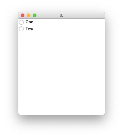
You can create simple radiobuttons as follows:
from tkinter import *

screen = Tk()
screen.geometry('400x400')

v = IntVar()

Radiobutton(screen, text="One", variable=v, value=1).pack(anchor=W)
Radiobutton(screen, text="Two", variable=v, value=2).pack(anchor=W)

mainloop()
Output will be:

References have been used from here


