PLOTTING IN PANDAS
In this tutorial we are going to learn about the in-built pandas plotting function which is used for visualizing data in various graphs in pandas with the help of matplotlib and a dataframe.
Plotting in Pandas
We can apply different types of plots in pandas in using the matplotlib library which specializes in visually representing the analyzed data. Pandas has an inbuilt feature of plot which has a following syntax:
Syntax
df.plot(
x=None,
y=None,
kind=’line’,
ax=None,
subplots=False,
sharex=None,
sharey=False,
layout=None,
figsize=None,
use_index=True,
title=None,
grid=None,
legend=True,
style=None,
logx=False,
logy=False,
loglog=False,
xticks=None,
yticks=None,
xlim=None,
ylim=None,
rot=None,
fontsize=None,
colormap=None,
table=False,
yerr=None,
xerr=None,
secondary_y=False,
sort_columns=False,
**kwds,
)
If you are using jupyter notebook then just import the following libraries to start in Pandas:
Series Plotting in Pandas
We can create a whole whole series plot by using the Series.plot() method. This type of plot is used when you have a single dimensional data available. The example of Series.plot() is:
import pandas as pd
import numpy as np
s1 = pd.Series([1.1,1.5,3.4,3.8,5.3,6.1,6.7,8])
s1.plot()

Series Plotting in Pandas – Area Graph
We can add an area plot in series as well in Pandas using the Series Plot in Pandas. This type of series area plot is used for single dimensional data available. The example of series area plot is:
import pandas as pd
import numpy as np

series1 = pd.Series(np.random.rand(10))
series1.plot.area()

Scatter Plotting in Pandas
import pandas as pd
import matplotlib.pyplot as plt
import numpy as np

df = pd.DataFrame({'Name':["Hira", "Smith", "Laura","Alex"],
'Age':[23, 34, 21, 23],
'Gender':['f','m','f','m'],
'State':['California','Chicago','Florida','Texas'],
'Grades':[78,90,87,71]})

df.plot(kind='scatter', x='Age', y='Grades')
Output:

Bar Plot
df.plot(kind='bar',x='Name',y='Age')
Output:

Pie Plotting in Pandas
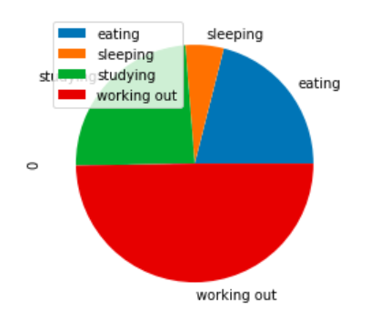
Pie plot is used for displaying portions or slices of data inside a circle. We are able to achieve that by using the matplotlib function known as dataframe.plot.pie() for a particular column. If no column name is provided then we use the subplot=True attribute to draw each numerical data on its own.
import pandas as pd
import numpy as np

df = pd.DataFrame(np.random.rand(4), index=['eating', 'sleeping', 'studying', 'working out'])
df.plot.pie(subplots=True)
Output:

Box Plot
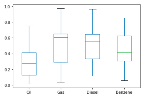
A box plot is a way of visually representing different groups of numerical data in quartiles. The box starts from Q1 until Q3 quartile and analyses the values with a middle line which is used for calculating median. The whiskers at both the end of the box are there to present the data range. Outliers are the points that are present beyond the whiskers.
import pandas as pd
import numpy as np
df = pd.DataFrame(np.random.rand(10, 4), columns=['Oil', 'Gas', 'Diesel', 'Benzene'])
df.plot.box()


