MATPLOTLIB IN NUMPY
In this tutorial, we are going to learn about matplotlib usage with numpy and a hands on experience on creating our first graph with numpy in this series. We will also take a sneak peak into some of the customization properties of matplotlib.
What is Matplotlib?
Matplotlib module is a module that is used for plotting beautiful graphs. We always need to visualize the data that we compute, it is the most important step. Through visualization, we can understand the data more proficiently. There are multiple libraries to visualize data but matplotlib is commonly used among data analysts and data scientists.

Importing Matplotlib
In order to import matplotlib and use it with numpy, we can use the following statement:
from matplotlib import pyplot as plt
We especially import pyplot() from the matplotlib library which is essential for plotting 2D data. Let’s look at a quick example to understand the connection of matplotlib and numpy in detail:
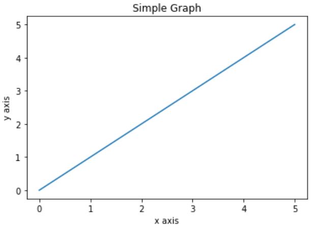
import numpy as np
from matplotlib import pyplot as plt

x = np.arange(0,6)
y = x
plt.title("Simple Graph")
plt.xlabel("x axis")
plt.ylabel("y axis")
plt.plot(x,y)
plt.show();
Output:
This is how you can use matplotlib for simple plotting along with numpy, let’s look at how we can apply different styles to our plots.
Customizing Matplotlib with Numpy
All the plotting we have done so far is based on matplotlib default style. In order to create your own prototype you need to switch from the default styles and your own set of color schemes. This is possible in matplotlib because of its flexible nature of providing multiple options of customization.
Let’s create a table of the number of colors of the graph line that we can use currently in matplotlib:
| Abbreviation | Color |
| ‘b’ | Blue |
| ‘g’ | Green |
| ‘c’ | Cyan |
| ‘r’ | Red |
| ‘m’ | Magenta |
| ‘y’ | Yellow |
| ‘k’ | Black |
| ‘w’ | White |
Let’s look at a quick example to see customized colors:
import numpy as np
from matplotlib import pyplot as plt

range_ = np.linspace(0,2*np.pi,100)
x = np.sin(range_)
y = np.cos(range_)

plt.title("Simple Graph")
plt.xlabel("x axis")
plt.ylabel("y axis")
plt.plot(range_,x, color='k')
plt.plot(range_,y, color='g')
plt.show();
Output:

You can create your own multiple customized graphs using numpy data to suit your own requirement, to learn more about graphs and styles in detail, please go to our matplotlib section.

