HISTOGRAMS IN NUMPY
In this tutorial, we will learn about creating histograms in numpy along with using matplotlib library followed by a handy and simple example:
What is a Histogram?
Histogram is a kind of a bar chart that is used for representing statistical information by how a bar looks based on the probability distribution i.e. the complete of class intervals (grouped set of data) and frequency distribution on x and y axis. Histograms also has bins which are the difference between the frequency distribution values. If frequency distribution values are equal in intervals then the bins would be same in size else different intervals will have different bin sizes.
What is Histograms in Numpy?
NumPy has a numpy.Histogram() characteristic that is a graphical representation of the frequency distribution of information, but we will be creating histograms in matplotlib to keep things simple. In histograms, the total range is represented from min to max values which are divided into equal parts in terms of width. These parts are known as bins or class intervals.
import numpy as np

a = np.array([21,22,23,24,25,26,28,30,32,33,34,35,40,41,42,43,44,50,51,52,55,56,56])
np.histogram(a,bins = [0,20,40,60,80,100])
hist,bins = np.histogram(a,bins = [0,20,40,60,80,100])
print hist
print bins
Output:
[ 0 12 11 0 0]
[ 0 20 40 60 80 100]
Let’s look at a quick example of how to use histogram with matplotlib in numpy:
import numpy as np
import matplotlib.pyplot as plt
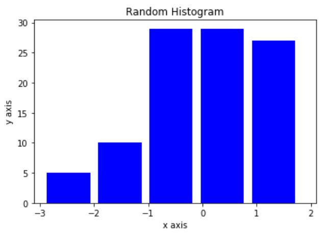
x = np.random.randn(100)
plt.hist(x, color='b', bins = 5, width=0.8)
plt.title("Random Histogram")
plt.xlabel("x axis")
plt.ylabel("y axis")
plt.show()
Output:
We will learn about using histograms in detail in our matplotlib section.

